Case-Shiller Index

Owning a home is part of the American Dream. While it goes hand in hand with the social idea of raising a nuclear family, the economic value of owning a home brings security. Historically, the value of a property has almost always increased over time. “Even with modest inflation of 5 percent a year, a typical house will be worth more at the end of a 30-year mortgage than the purchase price plus all interest, taxes, and insurance combined” (NY Times).  

However, the American homeownership rate peaked at 69.20% in the second quarter of 2004 and dropped to below 63% in 2016 (Trading Economics). While the homeownership rate is rising again, the trend of the past decade shows a clear decrease in homeownership. Simultaneously, the Case-Shiller Index has been increasing over the same period. The Case-Shiller Index is a lesser-known economic indicator that “tracks changes in the value of residential real estate, both nationally and in 20 metropolitan regions” (CNBC), and can explain homeownership rates and construction rates in the economy. The Case-Shiller Index is calculated by measuring changes of single-family homes by comparing the sale prices of the same properties over time (Investopedia). 

The increase in the Case-Shiller Index means an increase in home sale price, which can lead to fewer people being able to purchase a home. This result is usually related to a low supply and high demand for housing which encourages developers to create new housing units. 

Case-Shiller Index over time
American Home Ownership Rates over time

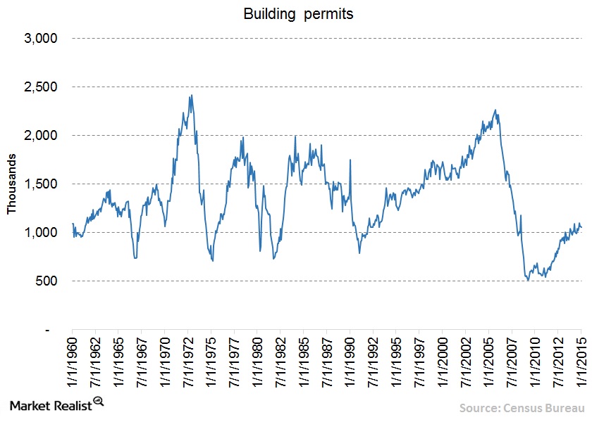
Let’s take a closer look at how the Case-Shiller Index impacts specific communities and reflects the state of the community’s economy–specifically in the San Francisco Bay Area. The most recent Case-Shiller Index in the San Francisco Bay Area reads 270.23 index points––this measurement is double the value in 2012. The resale value of homes has skyrocketed, and the homeownership rates are plummeting. According to The Mercury News, as of July 2019, “homeownership in the Bay Area hit a seven-year low last quarter,” coming out to be 51.7%. Homeownership in the Bay Area is extremely expensive due to the strong demand for housing in the Bay Area, however, it has encouraged an increase in supply. It led to a construction boom in the Bay Area for housing that has since slowed. In the years 2016-2019, there have been close to 14,000 units or homes built in San Francisco (SF Chronicle), but the start of new construction has slowed dramatically. Reasons cited include “a combination of higher construction costs, escalating fees, a softening market and increased interest rates has persuaded many builders to wait on the sidelines” (SF Chronicle). Now developers are saying that “projects with a projected price of $1,300 or $1,400 per square foot are not worth it to developers,” but projects above the $2,000 per square foot price point will be built (SF Chronicle). This means that even as new construction occurs, it won’t contribute to the desperate need for more affordable housing in the Bay Area. However, in June, Google promised $1 billion to create new housing units to alleviate the Bay Area housing crisis. They have pledged their money to develop 15,000 new homes and contribute to affordable housing, too (LA Times). The drop in overall home construction permits is the “start of a worrisome trend” (Mercury News). Not only will people continue to struggle to afford housing but the halt on construction projects puts people out of jobs as well. 

Regardless, the Bay Area economy will continue to boom because it is sustained and backed by the tech industry. Even if the Case-Shiller Index continues to rise in the Bay Area, the tech industry will continue to supply high wages and residents will continue to pay the inflated prices. This scenario applies to the people employed by the large tech-giants. People who are caught in the Bay Area without high wages will struggle to afford housing, but the overall economy will still excel based on the spending and circulation of high wages. 

When Economic Indicators Fall Short: a Case Study of the Olympic Games


Every four years, the world comes together for the most prestigious athletic competition there is: the Olympic Games. This culmination of athletic excellence is one of the most watched events in all of television. In fact, NBC Sports Group called the 2016 Rio Olympics “The Most Successful Media Event in History” after the event drew over 3.6 BILLION viewers  and NBCSN streamed an “unprecedented 6,755 hours of programming for the games.” But the Olympics impact more than just television. Host cities become landscapes of arenas and stadiums. Living rooms across the world are filled with both enthusiastic cheering and defeated sighs. Groceries stores on every corner see massive increases in sales of staple snack foods, like potato chips and soda. Clearly, the Olympics are an event with far reaching influence, but what does that mean when it comes to the economy? And more specifically, how well do the Olympics serve as an economic indicator for the country that hosts them? 

Given the magnitude of the Olympics, it would make sense for one to assert that the economies of the hosting countries must be in an excellent place. This is supported by the fact that even joining the race to potentially host is quite an investment. Tokyo, for example, spent $150 million dollars on its bid for the 2016 Summer Olympics. And the most painful part? Rio de Janeiro, Brazil was selected as the host city that year. 

The pay in is hefty, but once a city actually is selected to host, the costs only continue to increase. Most often, cities must undergo a massive change in infrastructure. The construction and updates of venues, hotels, roads, airports, and other necessary facilities can cost cities billions of dollars. Taking on such an investment requires immense faith in one’s economy and a commitment to government spending. In 2008, Beijing spent around $42 billion dollars hosting the Olympics. In 2004, Athens spent $15 billion. In 2016, Rio spent over $20 billion to host. This is no cheap endeavor and often even the projected budgets are nowhere close to the actual cost of the event. 

This graph from the Council on Foreign Relations illustrates that host countries often are unaware of just how much government spending they are agreeing to when they host the Olympic Games.

But as we know, government spending is a huge part of the global economy. So if a city is dramatically increasing spending, they are putting money into the economy, creating economic stimulation and increasing the country’s GDP. In addition, the aforementioned infrastructure construction would create millions of jobs and potentially attract workers from other countries.  Those workers will then also be contributing to the economy when they spend their earned wages. 

But all of those changes happen before the games even begin. As it gets closer to the actual games, tourists from all over flock to the host city, increasing the amount of money spent on things like tourist attractions, retail goods, hotel rooms, restaurants, and historical landmarks. People also spend a large amount of money at the Olympic venues themselves, which further stimulates the country’s economy. Increased sales means increased consumer spending which also increases the country’s GDP. 

All of these shifts seem positive; decreased unemployment, a potential increase in population, an increase in retail sales, and an increase in consumer spending — all of these changes are typically indicators of economic growth. These numbers, however, are always not indicative of reality. 

In reality, the spending is simply too large to bounce back from and host countries’ economies often suffer from the massive spending. In 2008, Beijing made $3.6 billion off the Olympics. This may seem like a good number, but recall that they spent $40 billion in the first place. Athens’ damages were even worse. The city struggled to finish it’s construction in time and even after it did, the cost of the 2004 Olympics pushed Greece’s economy into a massive sinkhole. In 2004, debt was the highest in the European Union coming in at 110.6% of the GDP. In 2005, they became the first country in the EU to be placed on fiscal monitoring. In the years following, the country amounted $342 billion dollars in debt and faced massive economic recession that lasted until only a few years ago. And while the Olympics are certainly not the only factor in Greece’s economic downturn, it “certainly didn’t help.”

The Athens beach volleyball stadium where 7,000 people once watched Keri Walsh and Misty May win gold now lays in ruin.
The Athens Olympic pool lies in devastating filth.

All across the world, massive Olympic stadiums lay in ruin, abandoned due to the price of upkeep. These battered venues perfectly illustrate the long term economic impact of hosting the Olympics, reminding us that massive government spending has consequences and economic indicators are meaningless without context. As this analysis reminds us, one should exercise caution before they truly let the games begin.

US Treasury bonds and the yield curve

What are bonds?

Bonds are low-risk, fixed-income securities. Governments, in this case the US, issue bonds to raise funds. The US Treasury Department issues and auctions the bonds. There are several types of bonds including: short-term, long-term and inflation-protected bonds. Bond lifetimes range between a few months to 30 years.

Bondholders acquire these financial instruments to have a claim or stake in the government’s money. What makes bonds attractive to investors are the interest rates. The government pays bondholders semi-annually the full face-value of the bond plus the interest rate.

Current events

News outlets have been citing the inversion of the yield curve following the Federal Reserve’s (Fed) recent statements. The yield curve is a measure of bond maturity over time. This data gives investors, financial institutions and economists a sense of the value of investment. An inversion occurs when short-term bond yield rates are higher than long-term yield rates. Bond value fluctuates based on myriad economic factors.

In the chart above, 10-year bond yields have steadily declined since the start of 2019. This means that bonds are losing their value. Ultimately, bondholders are losing money from what should have been a low-risk investment.

The following chart shows a more in-depth view of 10-year bond yields for this month. The 10-year bond yield has reached somewhat of a historic low.

The details of the current inversion rests in the numbers. The long-term yield spread (2-year to 10-year bonds) rates are lower than the short-term spread (1-month to 1-year bonds). Even within the subsets of bonds there are inversions. For instance, the 1-year yield (1.77) is lower than the 1-month yield (2.09).

Why this matters?

Bonds are losing value. Investors and financial institutions are anxious. More importantly, though, is that the past four recessions (1981, 1991, 2001, 2008) were predicted by a preceding inverted yield curve. This is the reason why media outlets, governments and economists are worried.

The last yield curve inversion

The last time the yield curve inverted was in December 2005. The Fed became aware of a housing bubble in progress and raised the fed funds rate – the rate at which banks lend money to each other – to 4.25 percent. The goal behind this was to curb lending; making it more difficult for institutions and individuals to borrow money. That affected the 2-year yield curve by raising it to 4.41. percent, while the 10-year yield dropped to 4.39 percent. Over time the Fed kept altering the fed funds rate which also affected yield rates. The curve remained inverted for years after that.

What followed was the worst recession since the Great Depression. Economies across the world were affected by the housing bubble.

The Morning Beverage Brewing The American Economy

American adults are drinking record high amounts of coffee and the price of coffee is dropping along with it. According to Reuters, sixty-four percent of American adults had a cup of coffee in their previous day as of 2018. Some have labeled coffee as “black gold” because of its value in the global economy.  

Yet, the world’s largest coffee chain, Starbucks Coffee, is closing its doors at over 150 store locations in 2019. To many, it may feel like there is a Starbucks on every corner and the closing of these locations may seem insignificant but in the past, the trends of Starbucks have indicated the state of the economy as well future consumer trends.

In 1983, Starbucks CEO, Howard Schultz, began shifting the stores focus as a coffee bean retailer into a chain of American cafes. According to CNBC, sales soared from $2B to $9.4B between the years 2000 and 2007. There was a significant hit in 2007 and the American economy began to face the great recession. According to the New York Times, Starbucks had to close 600 of its stores at the height of the American recession in 2008. The company laid off more than 12,000 employees and the stock price dropped more than 24 percent of that year. The annual percentage change (rate of inflation) was at 3.8% in 2008 during this time.

In a study done by the NCA USA Economic Report, consumers spent $74 billion on coffee in 2015. With the coffee industry accounting for 1.6% of the total U.S GDP. The industry is keen on depicting consumer spending given the majority of adult Americans are drinking coffee.  

(Graphic created by NCAUSA)


Starbucks will be closing 150 stores in 2019, which is triple the number of stores that it closes annually. The result of this can be mere over-saturation of Starbucks cafes that flood the corners of American cities which leads to a lack of store loyalty to individual locations. This may also be a result of consumers beginning to show less interest in sugary beverages. Whatever the cause may be, the important takeaway is that  there is a possibility of an American recession in the near foreseeable future. 

The Dow Jones dropped 800 points on August 14th as a result of a global economic slowdown. The U.S is currently facing a trade war in China which can hurt chains like Starbucks who have 3,300 stores sprawled across their country as well as imports for various mugs and equipment that are produced in China. The global influence that Starbucks has, stands as a representation of  not only what is happening with American consumers but also for what is yet to come. Starbucks began experimenting with a new line of luxury store locations named “Starbucks Reserve” and has seen wide success, but if consumer spending does not reflect positively, This shift towards a fancy coffee cafe may hurt them in the future of their business.

Additional Sources:

https://www.reuters.com/article/us-coffee-conference-survey/americans-are-drinking-a-daily-cup-of-coffee-at-the-highest-level-in-six-years-survey-idUSKCN1GT0KU

https://fortune.com/2018/06/19/starbucks-store-closing/

https://www.nasdaq.com/markets/coffee.aspx?timeframe=10y

http://www.ncausa.org/industry-resources/economic-impact

The Juiciest Economic Indicator

For the average person, economic indicators can be difficult to read. How can one look at the statistics released by Trading Economics and understand how the price of palm oil can affect his or her life?

In searching for a method of explanation for non-academics, I came across interesting publications. Business Insider detailed many unusual indicators, including “The First Date Indicator” and the “Plastic Surgery Indicator.” These seemed quite obvious to me. In tough times, individuals try to combat their loneliness and turn to dating. In times of prosperity and confidence, people allow themselves to splurge on plastic surgery. 

But one stood out among the rest and urged me to research further: The Big Mac Index created by The Economist. It was meatier than the rest, an asset that economists could actually utilize in their projections. It gives the common person an idea of how their currency holds up against the rest.

Essentially, this index looks at the global prices of McDonald’s Big Macs and compares them. It’s based on the Purchasing Power Parity (PPP) theory that a basket of goods should eventually cost the same in various countries. The values of these goods can indicate the exchange rates for currencies.

https://www.economist.com/news/2019/07/10/the-big-mac-index

By looking at Big Mac prices, one may be able to elucidate the status of an economy and possible under or overvaluations. While this index is not precise, it can provide some interesting data.

Where it Falls Short

Naturally, prices will be lower in poorer countries, as labor is cheaper. Additionally, places like India have dietary restrictions that would prevent a Big Mac from performing well. The model uses a poultry version of this product so that India can be included in the index, but it isn’t the same. Israel provides kosher beef, while Islamic countries provide halal beef, both of which would affect price and production.

Moreover, some places consider McDonalds a western novelty, while others see it in a more casual light. Because of this, McDonald’s creates different marketing strategies for different countries. They may push harder with a more effective approach in the U.S. than in Sri Lanka. Overall, while McDonald’s is a single corporation, it can have a very different meaning between nations.

How it Surpasses Expectations

When the Economist first created this index, it was meant to be more amusing than reliable. What began as a fun tool to judge misalignments between currencies started to be taken seriously. In response, The Economist added an adjustment of GDP per person, making it more accurate. 

https://www.economist.com/news/2019/07/10/the-big-mac-index

It is now referenced to explain PPP in academic articles and textbooks, according to The Economist. One researcher, Li Lian Ong, went as far as to say that he believed the Big Mac Index could have been used to predict the Asian currency crisis. While seemingly trivial, this indicator makes a great deal of sense. One can study the movement of exchange rates in the long run, while also studying their currency’s purchasing power in other countries. 

What it Tells Us Today

The Big Mac Index was created in 1986 and has since fizzled out. Most of the information on it comes from the early 2000’s and stops around 2011. Despite this, current data is still available.

The table to the right is the data reported by The Economist in July of 2018. The Key Takeaways are:

  • Cheap currencies are inching closer to the dollar.
  • Only three countries have higher priced Big Macs than the U.S. (Switzerland, Norway, and Sweden).
  • The Euro is undervalued, but considerably less than before.

Over & Underevaluations

https://www.economist.com/graphic-detail/2019/01/12/the-big-mac-index-shows-currencies-are-very-cheap-against-the-dollar

The above graphic illustrates that almost all currencies are undervalued when compared to the dollar, specifically countries with emerging economies. This makes the dollar seem very robust. But checking statistics dating back to the birth of the Big Mac Index in 1986, undervalued currencies typically grow within a ten year period.

Like all economic indicators, the Big Mac Index cannot accurately tell us what will happen in the coming years. It allows us to study the past, present, and potential futures. Some people are its biggest allies, while others are its biggest critics. Personally, I know it isn’t the most telling or reliable indicator, but I think it’s a delicious way to digest economic data.

Sources

  1. “Beefed-up Burgernomics.” The Economist, The Economist Newspaper, 30 July 2011, www.economist.com/finance-and-economics/2011/07/30/beefed-up-burgernomics.
  2. “The Big Mac Index Shows Currencies Are Very Cheap against the Dollar.” The Economist, The Economist Newspaper, 12 Jan. 2019, www.economist.com/graphic-detail/2019/01/12/the-big-mac-index-shows-currencies-are-very-cheap-against-the-dollar.
  3. “The Big Mac Index.” The Economist, The Economist Newspaper, 10 July 2019, www.economist.com/news/2019/07/10/the-big-mac-index.
  4. Boesler, Matthew. “The 41 Most Unusual Economic Indicators.” Business Insider, Business Insider, 11 Oct. 2013, www.businessinsider.com/unusual-economic-indicators-2013-10.
  5. Ong, L.I.. (2003). The Big Mac index: Applications of purchasing power parity. 10.1057/9780230512412. 
  6. “Our Big Mac Index Shows Fundamentals Now Matter More in Currency Markets.” The Economist, The Economist Newspaper, 20 Jan. 2018, www.economist.com/finance-and-economics/2018/01/20/our-big-mac-index-shows-fundamentals-now-matter-more-in-currency-markets.
  7. Pakko, Michael R., and Patricia S. Pollard. Burgernomics: A Big Mac Guide to Purchasing Power Parity. Nov. 2003, files.stlouisfed.org/files/htdocs/publications/review/03/11/pakko.pdf.


The Witching Hour of the Yield Curve

To an economic layman such as myself, the words “inverted yield curve” do not immediately mean too much. However, hearing that this past August was the first time the U.S. had an inverted yield curve since before the 2008 recession seems like cause for alarm, so I have attempted to break down this indicator. 

The yield curve measures how the interest rate (or yield percentage) changes over a certain maturation period. With U.S. Treasury bonds, the curve takes into account whether the Fed raises or lowers interest rates and if investors believe their money will have future value or not.  When looking at the curve, it’s clear to see that in a healthy economy the yield curve should slope upward as that indicates investors believe that both investing now is wise and that future bonds will appreciate in value. When the yield curve inverts in slope, this indicates that investor confidence in the market’s future is low and that they would rather keep their money in long term bonds than current investments. Yield percentage on long term bonds (Ten years +) has an inverse relationship with demand, so as investor and Federal Reserve confidence in the market goes up, long-term yield prices will drop. 

Basically, when the yield percentage on bonds is greater for ten year bonds, that means less investors are buying ten year bonds and are instead investing in short term high-risk and high-reward investments. This bodes well for the economy as it means investors will spend believing they can get return soon. If the curve inverts, this means investors do not want to spend now and in turn that U.S. economic prospects look dim. Summer of 2019 has been the first time since the Great Recession that the curve has inverted, leaving economists fearing what comes next. 

Economists are concerned and wary because historically, the inverted yield curve occurred six to nine months before recessions (only one time in the past 70 years has this indicator been proven wrong). However, the inverted yield curve doesn’t necessarily directly cause recessions. The tricky reality is that economists have not been able to come to a consensus on what the isolated link between the inverted yield curve and recessions are, so for now though there is cause for concern, there isn’t cause for despair. 

For the present U.S. economy, these indicators could point towards the uncertainty surrounding trade agreements and tariffs (particularly with China). Some say this will make goods cost more,  and that there will be fewer jobs both supporting the production of those goods as employees and paying for the goods as consumers. Most economists agree that recessions are an inevitable season in a country’s economic life, and a recent study by the National Association for Business Economics found that 74% of business economists believe a recession will hit the U.S. by 2021. The consistency with which inverted yield curves have predicted recessions is stark and undeniable, but in order to more wholly assess the health of the U.S. economy, the many other economic indicators have to be weighed equally. 

Sources:

  1. https://www.marketwatch.com/story/5-things-investors-need-to-know-about-an-inverted-yield-curve-2019-08-14
  2. https://www.youtube.com/watch?v=ukfA65KYyBY
  3. https://www.youtube.com/watch?v=bItazfbSptI
  4. https://www.youtube.com/watch?v=oW4hfaiXKG8

Black Death: Higher Wages Drive Progress?

Instead of trying to predict the future economic outlook of today, this blog takes on a retrospective stance on European economic growth from the 14th-16th centuries.

In the 1340s Italian ports in Genoa and Venice thrived on trade and commerce. Traders from Asia were a regular sight, bringing spices and other luxury commodities from distant lands. It was a time of relative prosperity; however, within a couple of years, Europe would live through its worst plague epidemic, Black Death, that would ultimately wipe out roughly a third of the European population and change the course of its economy. In less than a decade more than 20 million people perished from the mysterious disease. Yet, amidst the chaos something interesting was brewing – wages started climbing rapidly.

At the time of the feudal system, peasants rarely had any choice and no income mobility. The wages were low, and the cost of capital was high. The Black Death has suddenly swayed the odds in the peasants’ favor. In order to understand how the epidemic affected labor and wages, it’s crucial to understand the supply and demand framework. The supply and demand of labor rest at equilibrium, meaning that if the working population were to suddenly drop, labor would become scarcer and wages would rise, establishing a new equilibrium. As the population rapidly decreased, there were fewer labor units available. It was only logical for peasants to demand higher wages from their lords. Lords, in turn, had no choice but to pay more because the number of fields to plow, remained the same. 


(Image cited from The Economist)

The wages were so high that England passed a law in 1349 forcing peasants to accept wages they received before the plague. As peasants gained more leverage, many lords were forced to give them broader freedoms and better working conditions. This time period of high wages became a milestone that ultimately led to the dissolution of Feudalism altogether in the 16th century.

As the wages spiraled out of control so did the inflation. According to The Economist, within the first 4 years of the epidemic, the average wheat prices rose 300%. Nevertheless, the lords enjoyed higher profits as prices went up and the peasants appreciated higher wages. People in Europe now had more purchasing power and a stronger incentive to maximize the efficiency of production as labor costs piled up.

Although the European economy underwent a post-plague recession it has reemerged as an economic powerhouse a century later. New innovations stemmed from scarce labor, higher wages, and greater purchasing power. Novel double-entry bookkeeping revolutionized accounting processes while banking systems became more complex. The printing press was invented in an effort to balance out the high wages and labor deficit. Technological advancements in shipbuilding allowed for exploration and unprecedented trade growth.

The Black Death was a horrifying time period in Europe which severely damaged the economy. At the same time, its side effects spurred immense growth within the region. Labor scarcity and high wages might have not been the sole ingredients in such a change, but they certainly had encouraged innovation in different practices and altered the societal structure which set Europe on the path of progress.

Sources:

http://msh.councilforeconed.org/documents/978-1-56183-758-8-activity-lesson-15.pdf

https://eh.net/encyclopedia/the-economic-impact-of-the-black-death/

https://theconcourse.deadspin.com/after-the-black-death-europes-economy-surged-1821060986

https://www.economist.com/free-exchange/2013/10/21/plagued-by-dear-labour

https://www.brown.edu/Departments/Italian_Studies/dweb/plague/effects/social.php

“Building” up the GDP

Real estate has been a driving force shaping economics in America for years. Many factors in the real estate market can predict or explain the ups and downs of the economy. More specifically building permits and housing starts “can be early indicators of activity in the housing market”. http://www.incontext.indiana.edu/2001/april01/details.asp

Building permits are a great way to indicate the fluctuations of the economy. This is due to the fact that building permits lead to new housing construction which in turn leads to new job availability and an increase in housing material production. “If more building permits are issued, this indicates more investment will likely be allocated to the housing market.”  Additionally, an increase in commercial building permits could indicate businesses are expanding and an increase in building permits for warehouses could “be a sign that commerce will increase in the coming years.” All of these factors that deal with the amount of building permits issued could bring stability and wealth to the economy and GDP when they are increasing and thus are a great economic indicator. https://www.investopedia.com/terms/b/building-permits.asp

https://articles2.marketrealist.com/2015/02/understanding-building-permits-impact-homebuilders/

For example, as seen in this chart above, more building permits were issued from 1990 to 2005, when the economy was at its best. After 2005 we see a huge decline in the number of building permits which reflects how the economic conditions during that were not favorable.

Recently, new home construction fell in May 2019, however we can see from this data that building permits remain steady. JPMorgan Chase & Co.’s, Jesse Edgerton, quotes that this building permit data “suggests little cause for immediate concern.” However from this data we also see that building permits are not always inline with housing starts. This is due to the fact that housing starts can be influenced by many outside factors. Currently, rising construction costs are making it ” challenging to build homes at affordable price points relative to buyer incomes.”

https://www.cnbc.com/2019/07/17/us-housing-starts-june-2019.html

21st Century: Internet Speed as an Economic Indicator

The Internet’s impact on global growth is rising rapidly. The Internet accounted for 21 percent of GDP growth over the last five years among the developed countries MGI studied, a sharp acceleration from the 10 percent contribution over 15 years.
(McKinsey Analysis)

The next time you are in a public place take a look around you. Nine out of ten people you see have just recently been on the internet. And among young adults ninety-nine out of every one hundred have recently been online. The internet has changed our lives in the way that we are able to do work, exchange and discover new ideas, socialize, and communicate with one another. However, it is not often that we think about the significance of this transformation in economics and how it can be used to measure economic growth. 

Individuals from large enterprises, individual consumers, and small up and coming entrepreneurs all benefit from the enormous opportunities the internet has created such as building a competitive environment, boosting infrastructure and access, providing purchasing power, as well as nurturing human capital. In harmony these components have maximized economic growth and prosperity. 

If internet were a sector, it would have a greater weight in GDP than agriculture or energy. (McKinsey Analysis)

If measured as a sector of the GDP, internet related consumption and expenditures, would be larger than the agriculture and energy sectors. In the McKinsey Global Institute study on broadband internet and economic growth and prosperity, internet accounted for 3.4% of the GDP in the 13 nations researched.  

Internet speed can be used as an economic indicator because it correlates with a given countries internet contribution of GDP. Countries with a strong internet supply in terms of speed and broadband connectivity strength correlate with a higher internet contribution to GDP. For example, Sweden and The United States have the best “internet ecosystems” in the world and this correlates with their internet contribution to GDP. Which is respectively 3.9% in Sweden and 4.7 % in the United States. The average internet connection speed in Sweden is 22.5 Mb/s and 18.7 Mb/s in the United States. When compared to Germany which has a lower average connection of 15.3 Mb/s, internet related expenditures only account for 1.9% of the Germany’s GDP.  

Internet Contribution to GDP (McKinsey Analysis)

However, it is important to highlight that in most studies on developed nations it is noted that this positive correlation of broadband strength and economic growth reaches a threshold and other economic indicators should be used in conjunction when accessing economic growth. 

Sources:

https://www.statista.com/topics/2237/internet-usage-in-the-united-states/

https://www.businessinsider.com/mckinsey-report-internet-economy-2011-5

https://en.wikipedia.org/wiki/List_of_countries_by_Internet_connection_speeds

https://www.mckinsey.com/~/media/McKinsey/Business%20Functions/McKinsey%20Digital/Our%20Insights/Essays%20in%20digital%20transformation/MGI_Internet_matters_essays_in_digital_transformation.ashx

Increased Auto Repair Service Sales Could Indicate Recession

It is often said that the decisions of one impact the lives of many. Decisions on what to spend money on and when to spend accumulate into a collective force that dictates the growth or decay of the economy. This means that, behaviorally, the confidence the individual has in the continuation of their income will dictate whether or not they decide to spend money at that point in time in the first place. 

Large investments such as cars and property have been used as a means of measuring the confidence of that consumers have on their economic future. Because of the size of the cost, money is often borrowed for such purchases and these goods are often used as equity for other loans. When the economy is doing well, people are more inclined to purchase homes and cars (both old and new) with the assurance that they will be able to pay off the debt of their mortgage or car loan. On the flip side, during a recession, sales tend to slow as consumers become more reluctant to make such risky purchases due to the chances of defaulting and high interest rates. Overall, consumers tend to withhold their spending in most markets when their confidence in the growth of the economy, and their spending money, is low. 

Motor vehicle sales are often used as an indicator of economic health. During the Great Recession, auto sales dropped significantly. Source: Yardeni Research Inc.

While it is often thought that all business tends to slow during a recession, there is one particular enterprise that actually benefits from an economic downturn: auto repair shops. 

The heavy investment in vehicles makes commodities like cars precious. They endure regular wear and tear or collision damage, which inevitably leads to the end of the car’s use. Historically, car owners were more willing to trade their car in for a new model after every two years to avoid dealing with repair bills while enjoying the upgrades in fuel efficiency and better manufacturing. 

During the Great Recession in 2007-2008, people divorced themselves from that habit to save money. As cars aged and began to break down, car owners had to invest in auto servicing, increasing auto repair sales by 10.5% from 2007 to 2011.

Between the Great Recession and the eventual recovery of the economy in 2015, car owners refrained from buying new cars, resulting in an increase in the average age of cars that were not purchased in a “used” condition.

As with all indicators, there are a few factors to consider when analyzing the economy through auto repair sales. For one, it is important to note the rising cost of both cars and car parts due to new automotive technology such as self-driving and improved collision safety engineering, which can factor into the overall increase in consumer expenditure in that market. US-based insurers Travelers reports that the cost of repairing a 2018 sedan is up to three times higher than a 2017 model. These increased costs are projected to be an investment in driving safety, which could ultimately be offset by reduced frequency and intensity of vehicle accidents in the future, which means less-frequent spending on auto repairs.