Is It Time To Walk out? How the Strikes Indicate the Business Cycle.

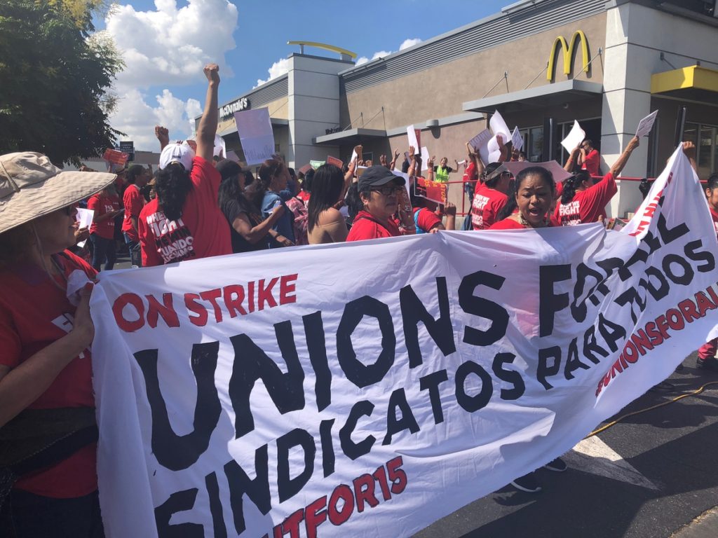
Labor strike has a long history since the industrial revolution, dating back to early 19th century in Europe. It is rarely a top news today. The barista who made a coffee for you at Starbucks, the cleaner who mopped the floor at McDonalds, and your favorite barber at the street corner, may have once protested on the streets.

Fast food workers went on strike at East Los Angeles. Photo taken by Moting Jiang.

It won’t disturb you too much under most circumstances, unless, for example, the angry railway workers make the company cancel your train. But to some extent, the labor strike can tell you what’s happening to our economy, which might somehow impact your life.

Worker strikes can have a wide range of incentives, and in this blog we focus on the economic ones, that is, those over mandatory issues such as wages, working hours, union rights and so on. It is not hard to detect that the number of economic strikes fluctuate yearly. At certain points the workers seem much more proactive than usual, and we can name this phenomenon as the strike cycle. Does it remind you of something? Our economy has periodic expansion and recession too, referred to as the business cycle. Does these two cycles correlate?

Conceivably, it is assumed that strikes occur more frequently and last longer at the period of economic recession; the album of economic depression always contains the pictures of desperate penniless workers marching on the roads. The employers intend to lower the wages and dismiss the employees in an attempt to make their shrinking business survive, consequently arousing disputes and frustrations. However, regarding the demand and the supply of the job market, it is also likely that employees are less inclined to strike when they are at a risk of being crowded-out, while their bargaining power improves during economic expansion. If the workers are rational and self-interested, seemingly they will not irritate their boss when they are losing money.

What Studies on Historical Data Tell Us

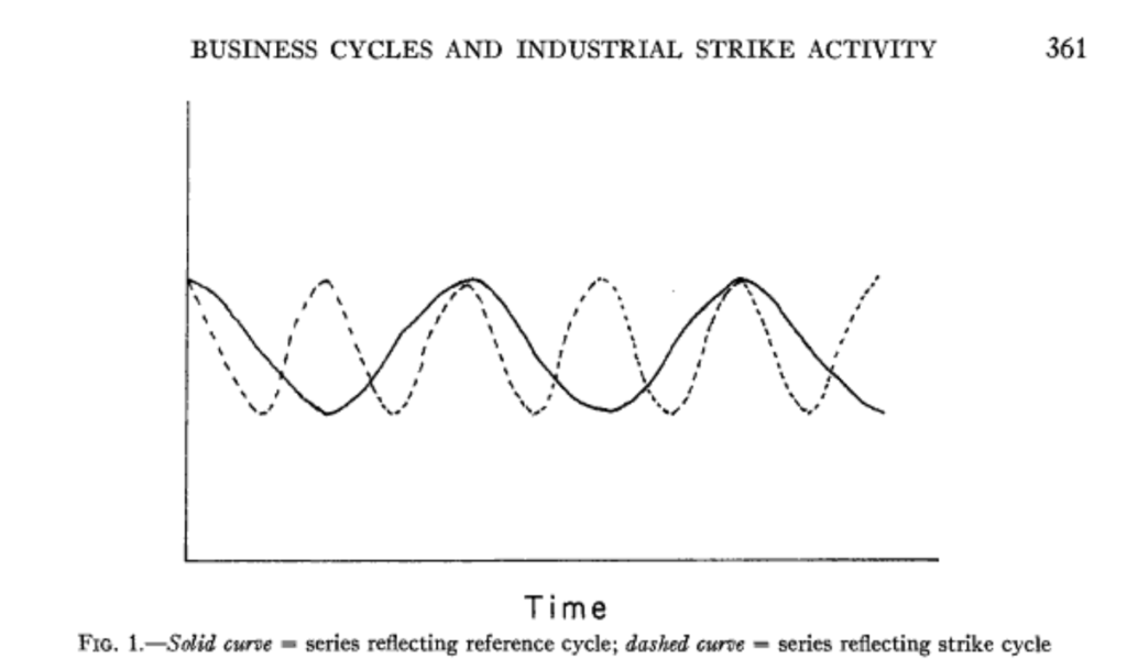
A 1952 study by Rees compares the Bureau of Labor Statistics(BLS) series on monthly strikes with the reference business cycle of the National Bureau of Economic Research(NBER) after WWI. It concludes that there is a significant conformity between the two cycles, and the strike peak constantly precedes the business one (Figure 1). Rees explains that the strike represents the tension between union and employers. When the economic expansion is starting, the union has higher expectations while the employers react negatively to it, so their divergence reaches the maximum level.

Figure 1. Credit to Rees, A. (1952). Industrial Conflict and Business Fluctuations. Journal of Political Economy, 60(5), p.361

Some scholars focus on the the relations between strike duration and the business cycle instead. The Institute for the Study of Labor issued a paper in 2008, citing over ten thousand strikes recorded by the Engineering Employers Federation in Great Britain from 1920 to 1970. It discovered that the labor strike duration is countercyclical, that is, the strike will last longer at the time of economic upturn. Additionally, higher employment rate usually enables the union to achieve better outcomes.

It should be noticed that some economists are highly suspicious of the strike data as an economic indicator, concerning that (1) the strike can be driven by political activities such as election and political campaign;  (2)the strikes, like many human activities, can be random and irrational. Scully wrote after studying the strike cycle in mid-20th century that “there is no relationship between the strike cycle and the business cycle” in the long term (while in the short run they do correlate).

Work Stoppage and Economic Cycle in Post-WWII U.S.

What does the labor strike data tell us about the U.S. economics in the past 80 years?

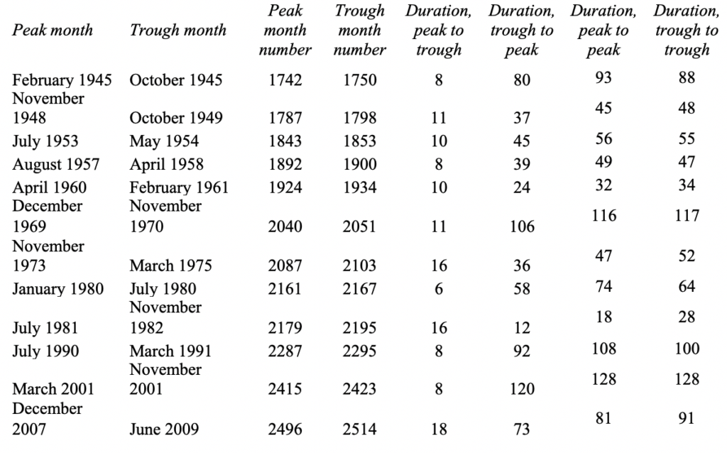
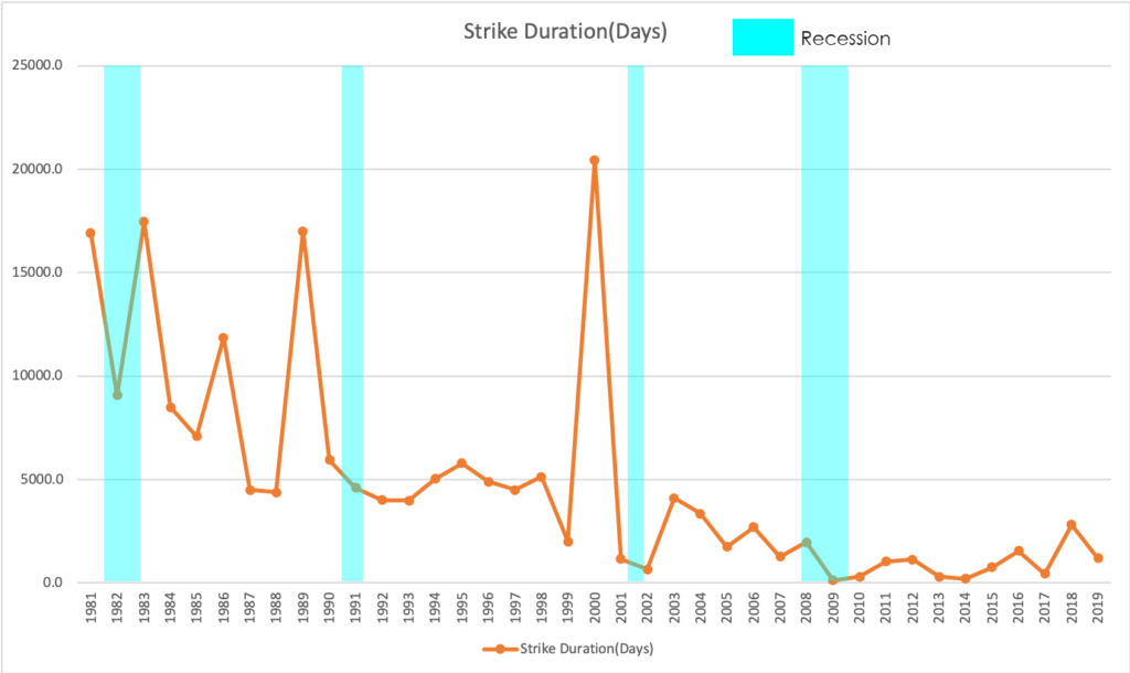
According to BLS statistics, the number of labor strikes in U.S. since 1940s has gradually declined, while still having a cyclical pattern (Figure 2).  BLS only recorded the days of idleness since 1980s, and it also displayed similar pattern(Figure 3).  With reference to the business cycle defined by NBER (Table 1), it is found out that the strike frequency never peaked during the recession. Except for 1948-1950 and 1957-1958 recession, when the economy is shrinking, workers are less inclined to protest on streets than they were in the previous year. When it comes to the strike duration, such correlation is less apparent, partly due to the lack of statistics. But it is still safe to claim that labor strikes usually lasted shorter than last year if the economic downturn is going on.

Table 1. The U.S. reference business cycle since the WWII. Credit to NBER https://www.nber.org/cycles/recessions.html
Figure 2. Data retrieved from Bureau of Labour Statistics and graph generated by the author. See BLS database at https://www.bls.gov/wsp/

Figure 3. Data retrieved from Bureau of Labor Statistics and graph generated by the author. See BLS database at https://www.bls.gov/wsp/

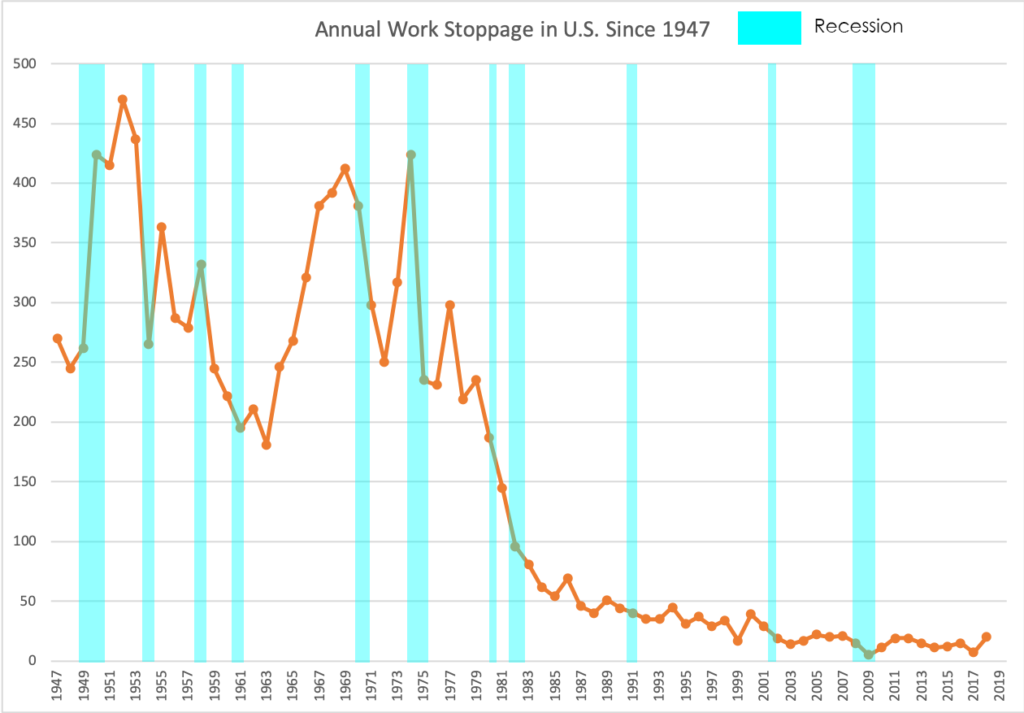
The above-mentioned evidences support the argument that labor strikes increase as the economy booms in order to maximize the union’s bargaining power. Nevertheless, business cycle can not account for all the characteristics of the strike cycle. For instance, the fluctuation of labor strike became very minor after 1990s, and it did not rise up significantly from 1991 to 2001 when the economic blossomed for almost a decade. Potential explanations lie in the development of union trades and labor rights legislation.

In conclusion, Labor strike data reflects the union’s behaviors as rational players in the economy. Trade unions are more likely to organize working stoppage when the business cycle is at its top, and workers are less likely to protest when the economy is falling down and offering less jobs. However, given that other factors especially the political events also exert an essential impact on trade union’s decision-making, it requires more caution to treat strike data as an economic indicator.

Reference

Scully, G. (1971). Business Cycles and Industrial Strike Activity. The Journal of Business, 44(4), 359-374. Retrieved from http://www.jstor.org/stable/2352052

Rees, A. (1952). Industrial Conflict and Business Fluctuations. Journal of Political Economy, 60(5), 371-382. Retrieved from http://www.jstor.org/stable/1826482

Devereux, P. J., & Hart, R. A. (2011). A good time to stay out? Strikes and the business cycle. British Journal of Industrial Relations, 49, s70-s92.

U.S. Bureau of Labor Statistics. https://www.bls.gov/

The National Bureau of Economic Research.https://www.nber.org/cycles/recessions.html

Men’s underwear may tell you how the economy is doing

Photo credit to Global Times

A rise in men’s underwear sales might be part of the signal that the Liaoning Province in northeast China’s is on the path to recovery.

The economic growth of Liaoning Province was 4.2 percent in 2017 and 5.6 percent in 2018. At the same time, according to a report released by JD Big Data Research Institute, part of one of China’s biggest online shopping sites, sales of men’s underwear in Liaoning rose 42 percent in 2017 over the previous year and went to another 32 percent in 2018. The rate of increase in underwear sales in Liaoning was greater than in any other province. An analysis of consumption also shows that Liaoning’s consumers pay more attention to the quality and color variety of clothes.

“The recovery is mainly due to coal and steel prices rising during the period, and the recovery can also be seen in the volume of railway and road freight, electricity consumption of industry, volume of business and employment,” said Liang Qidong, vice president of the Liaoning Academy of Social Sciences, on a Global Times report.

Liang also addressed that the Men’s Underwear Index and similar indexes like “yogurt index” and “bread index” could be taken as an economic indicator.

Liang was not the first person to come up with the concept. Back in the 1970s, Alan Greenspan, the former chairman of the Federal Reserve, first introduced and popularized the Underwear Index. Greenspan found that there was a close connection between the economy’s performance and the sales of men’s underwear. Declines in the sales indicate a weak economy, while upswings predict a recovery in the economy. Behind the theory, a basic assumption is that men’s underwear is a necessity instead of a luxury item, so sales of men’s underwear will keep relatively stable except in times of a sluggish economy. Therefore, men’s purchasing habits for underwear is thought to be an effective economic indicator that can detect the beginning of a recovery during an economic downturn.

The sales of men’s underwear dropped in an economic recession in the United States. Data show a 2.3 percent drop in sales of entire men’s underwear products in 2009, according to Mintel, a London-based market research firm. While as the economy recovers, sales of men’s underwear in the United States have risen. As reported by Quartz, U.S. underwear sales grew by nearly $1.1 billion between 2009 and 2015, after falling in the wake of the 2008 financial crisis. Hanes, a popular lingerie brand, has seen a similar trend.

“If you look at sales of male underpants it’s just pretty much a flat line, it hardly ever changes,” economist Robert Krulwich told HuffPost in an article after the publishing of Greenspan’s book, “The Age Of Turbulence.” “But on those few occasions where it dips that means that men are so pinched that they are deciding not to replace underpants. And [Greenspan] said ‘that is almost always a prescient, forward impression that here comes trouble.’”

However, the concept may be not academically accurate, even though the Underwear Index can be used to reflect the economic situation from a province to a nation. Several reasons presented by critics on Investopedia should be considered, including the frequency of women purchasing underwear for men, and an assumption that men would not purchase new underwear until it is threadbare, regardless of the economic condition.

Sustainable Fashion for a Sustainable Economy

It’s all eyes on Fashion Week season – but not exactly for the insight into Spring/Summer 2020 trends. This September runway will showcase exactly which designers will be taking sustainability into design consideration and which ones will not. London Fashion Week garnered atypical recognition last year with protestors hitting the streets to demonstrate the negative effects on climate change deriving specifically from the fashion industry. While non-sustainable measures often ensue from the cost-cutting nature of fashion brands, the long-term global economic benefits of being “green” should be noted. 

A 2016 EPA report reveals that about 9% of all solid waste in the United States come from rubber, leather and textiles suggesting that a tenth of the our climate problem is attributed to one industry. With that type of power, the potential to improve the economy may come from fashion brands and their sustainable efforts. 

The Green Tradeoff

Shoppers want to make greener purchases, but sometimes budgetary constraints do not allow them to do so. With 75% of consumers agreeing that a brand’s sustainability is important to them, it should be in the best interest of a company to take eco-conscious initiatives. However, for a consumer to be able to shop sustainably they might have to spend almost eight times more. When searching for wardrobe staples — perhaps a black midi dress — a sustainable consumer could seek out Reformation and pay $218. But fast fashion brand H&M (HMRZF) lists a similar dress at an affordable price of $24.99. For a company such as H&M, implementing “greener” policies would raise costs and put them at a risk to losing customers that cannot manage or justify such purchases. 

Credit: H&M
Credit: Reformation

Climate Damage Also Means Economic Damage

A 2018 study by Tom Kompas of the University of Melbourne concluded that countries that comply the most with the Paris Accord will see significant economic benefits compared to those that do not comply. In some cases, the economic damages could range from $9.5 to $23 trillion per year. Not only are irresponsible fast fashion policies causing irreversible damage to our climate, but they also are indicating global economic damages of irreparable proportion.

The incentive for the government to enact and enforce green policy, primarily in the fashion industry, is clear: as production becomes cleaner, global economies benefit, suggesting accelerated GDP growth. Buyers will continue to choose environmentally detrimental brands simply for the savings. If policy were to change and more companies were rewarded for their eco-friendly initiatives by the government, more eco-friendly options at a range of prices would become available to the public, promoting spending.

Presently, our administration has made policy decisions that are not in the best interest of the climate. When creating his model, Kompas had no choice but to assume that the United States would still be following the Paris Accord. In reality, we do not know for sure if or when we will ever join the Paris Accord again. This likely skews Kompas’s study; the economic damages predicted could very well be much worse. Policymakers and enforcers must take these actions into consideration for the sake of the health of the globe and the health of the global economy.

Additional Sources:

http://climatecollege.unimelb.edu.au/files/site1/seminar_documents/Kompas%20EF%202018%20REV.pdf

https://www.forbes.com/sites/kaleighmoore/2019/05/19/new-report-shows-sustainable-fashion-efforts-are-decreasing/#50b469737a4f

https://www.cnn.com/style/article/fashion-week-what-to-expect/index.html

https://www2.hm.com/en_us/productpage.0743995001.html

https://www.thereformation.com/products/graciella-dress?color=Black&via=Z2lkOi8vcmVmb3JtYXRpb24td2VibGluYy9Xb3JrYXJlYTo6Q2F0YWxvZzo6Q2F0ZWdvcnkvNWE2YWRmZDJmOTJlYTExNmNmMDRlOWM2

Building Permits as an Economic Indicator

Typically, when a city’s economy is performing well, it’s population will grow. A strong economy full of expanding, competitive businesses sparks an increase in job opportunities. This, in turn, leads to the construction of new office and apartment buildings. While this simplified chain of events seems rather self-explanatory, analyzing the volume of construction on a local and national level is a sufficient method of understanding the current state of the economy. In other words, looking at the number of issued building permits can provide a benchmark for just how confident businesses and consumers are feeling. In turn, it provides a useful gauge of how well our economy is performing.

By definition, building permits are a form of approval issued by either the government or a regulatory body before the construction of buildings are legally permitted to commence. Data pertaining to building permits is collected on a monthly basis and  is published by the U.S. Census Bureau. This data is collected nationally and broken down by region, state, metropolitan area and county. The data is published on the 18th of every month. 

A look at commercial building permits often signals that businesses are expanding and new ones are forming. Additionally, an increase in permits for warehouse space indicates that commerce, in the coming years, will most likely improve. 

Where commercial building permits indicate the current state of businesses, residential building permits are indicative of behavior and sentiments on a consumer level. For example, a rise in single family homes can indicate that residents have reached a level of economic agency where they feel comfortable enough settling down and moving into more spacious, permanent accommodations. 

Because building permits are not mandatory in all regions of the U.S., the number of building permits is typically fewer than the number of housing starts. Examples of construction and remodeling projects that typically do not require a building permit include: repainting a house, building small fences, repaving driveways and refurbishing kitchen appliances. 

When more building permits are granted, this means that more money will be allocated towards housing, and thus the number of housing starts will increase. However, if housing starts begin to drop in comparison to building permits, this means that construction may be postponed in accordance to environmental or economic conditions

So where does the activity of building permits stand today? This past July, building permits in the U.S. increased by 8.4% (See graph above). This surpassed the market expectation of 3.1%. This growth in building permits is the steepest gain the U.S. has seen since June 2017. When broken down by region, it reveals that this growth was felt most prominently in the West and the South. Overall, building permits totaled an average of 1.33 million for July 2019. So far, December, which reached 1.3 million permits, has been the high of 2019.  

In 2005, when the U.S. economy was at one of its best moments, building permits almost surpassed the record high of 2.41 million in December of 1972 (See graph below). However, leading up to the 2008 recession, the number of building permits plummeted. As demonstrated by the data for June 2019, they have since recovered and are currently climbing. As an economic recession looms in the future for the U.S., building permits will be a key indicator to watch in the near future. 

Sources:

http://www.incontext.indiana.edu/2001/april01/details.asp

https://tradingeconomics.com/united-states/building-permits

https://marketrealist.com/2015/02/understanding-building-permits-impact-homebuilders/

Motor Vehicle Sales Predict the Future of the U.S. Economy

(Photo Credit to Brookings.edu)

Motor vehicles have become a major part of the U.S. economy since its creation. They continue to rule the streets of the U.S. in the forms of cars, trucks, and buses. Although it has become such an integral part of our daily lives, the total sales of motor vehicles are the key to predicting the future of the U.S. economy. 

In the last 29 years, the U.S. economy has gone through tremendous ups and downs. The lowest the economy has fallen in the last 29 years was from 2007 to 2009. This period is known as the Great Recession. During the Great Recession, the unemployment rate doubled from 5% to 10%, about 3M households were foreclosed on from 2005 to 2009, and the GDP in the U.S. declined by 4.3%. For those living in the U.S. during this time, it became clear that there was something very wrong with the economy. 

To indicate how the economy is transforming through any time, economists may analyze the Gross Domestic Product, the Consumer Price Index, or the interest rate. However, an economic indicator that may not seem as apparent as the GDP, for example, is the total motor vehicle sales in the U.S. 

According to Julia Kagan at Investopedia, the total motor vehicle sales is “the number of domestically produced units of cars, SUVs, mini-vans and light trucks that are sold.” The total number of motor vehicle sales in the U.S. is measured by the reported sales by individual manufacturers on the first business day of every month. Although one may categorize the sale of motor vehicles as a part of consumer spending in general, motor vehicles play such an integral role in our society that it may act as an economic indicator.   

In Figure 1, it is clear that leading up to the Great Recession, the total vehicle sales in the U.S. was steadily positive from the period of 1991 to the middle of 2007. Then, the Great Recession occurred, and all motor vehicle sales dropped significantly until the beginning of 2009. Although there are various factors associated with this significant drop, it is important to note that, during this time, the Big Three automakers in the U.S. had to ask Congress for help similar to the bank bailout. At that point, General Motors Company and Chrysler LLC faced bankruptcy, and the Ford Motor Company needed help to compete with other automakers. Eventually, sales began to rise and have now started falling. 

In 2019, the first-quarter auto sales have dropped by nearly 2.5% from the previous year, according to J.D. Power and LMC Automotive. This is due to auto manufacturers producing more expensive cars rather than cheaper cars, which helps the used car industry but hurts the new vehicle market. However, it is important to also think about the demand for new cars. The demand for new cars may be decreasing due to various economic factors that relate to consumer confidence. Therefore, the total motor vehicle sales in the U.S. acts as an economic indicator that is telling of the future of the U.S. economy. 

(Photo Credit to Huntington Beach Ford)

Sources

https://www.investopedia.com/terms/m/motor_vehicle_sales.asp

https://www.cnbc.com/2019/03/26/us-auto-sales-are-falling-and-cars-are-more-expensive-than-ever.html(J.D. Power and LMC Automotive)

https://www.yardeni.com/pub/ecoindauto.pdf(Figure 1)

https://www.thestreet.com/politics/what-was-the-great-recession-14664025(Statistics: The Great Recession in Numbers)

https://www.history.com/topics/21st-century/great-recession-timeline

https://www.thebalance.com/auto-industry-bailout-gm-ford-chrysler-3305670

Case-Shiller Index

Owning a home is part of the American Dream. While it goes hand in hand with the social idea of raising a nuclear family, the economic value of owning a home brings security. Historically, the value of a property has almost always increased over time. “Even with modest inflation of 5 percent a year, a typical house will be worth more at the end of a 30-year mortgage than the purchase price plus all interest, taxes, and insurance combined” (NY Times).  

However, the American homeownership rate peaked at 69.20% in the second quarter of 2004 and dropped to below 63% in 2016 (Trading Economics). While the homeownership rate is rising again, the trend of the past decade shows a clear decrease in homeownership. Simultaneously, the Case-Shiller Index has been increasing over the same period. The Case-Shiller Index is a lesser-known economic indicator that “tracks changes in the value of residential real estate, both nationally and in 20 metropolitan regions” (CNBC), and can explain homeownership rates and construction rates in the economy. The Case-Shiller Index is calculated by measuring changes of single-family homes by comparing the sale prices of the same properties over time (Investopedia). 

The increase in the Case-Shiller Index means an increase in home sale price, which can lead to fewer people being able to purchase a home. This result is usually related to a low supply and high demand for housing which encourages developers to create new housing units. 

Case-Shiller Index over time
American Home Ownership Rates over time

Let’s take a closer look at how the Case-Shiller Index impacts specific communities and reflects the state of the community’s economy–specifically in the San Francisco Bay Area. The most recent Case-Shiller Index in the San Francisco Bay Area reads 270.23 index points––this measurement is double the value in 2012. The resale value of homes has skyrocketed, and the homeownership rates are plummeting. According to The Mercury News, as of July 2019, “homeownership in the Bay Area hit a seven-year low last quarter,” coming out to be 51.7%. Homeownership in the Bay Area is extremely expensive due to the strong demand for housing in the Bay Area, however, it has encouraged an increase in supply. It led to a construction boom in the Bay Area for housing that has since slowed. In the years 2016-2019, there have been close to 14,000 units or homes built in San Francisco (SF Chronicle), but the start of new construction has slowed dramatically. Reasons cited include “a combination of higher construction costs, escalating fees, a softening market and increased interest rates has persuaded many builders to wait on the sidelines” (SF Chronicle). Now developers are saying that “projects with a projected price of $1,300 or $1,400 per square foot are not worth it to developers,” but projects above the $2,000 per square foot price point will be built (SF Chronicle). This means that even as new construction occurs, it won’t contribute to the desperate need for more affordable housing in the Bay Area. However, in June, Google promised $1 billion to create new housing units to alleviate the Bay Area housing crisis. They have pledged their money to develop 15,000 new homes and contribute to affordable housing, too (LA Times). The drop in overall home construction permits is the “start of a worrisome trend” (Mercury News). Not only will people continue to struggle to afford housing but the halt on construction projects puts people out of jobs as well. 

Regardless, the Bay Area economy will continue to boom because it is sustained and backed by the tech industry. Even if the Case-Shiller Index continues to rise in the Bay Area, the tech industry will continue to supply high wages and residents will continue to pay the inflated prices. This scenario applies to the people employed by the large tech-giants. People who are caught in the Bay Area without high wages will struggle to afford housing, but the overall economy will still excel based on the spending and circulation of high wages. 

When Economic Indicators Fall Short: a Case Study of the Olympic Games


Every four years, the world comes together for the most prestigious athletic competition there is: the Olympic Games. This culmination of athletic excellence is one of the most watched events in all of television. In fact, NBC Sports Group called the 2016 Rio Olympics “The Most Successful Media Event in History” after the event drew over 3.6 BILLION viewers  and NBCSN streamed an “unprecedented 6,755 hours of programming for the games.” But the Olympics impact more than just television. Host cities become landscapes of arenas and stadiums. Living rooms across the world are filled with both enthusiastic cheering and defeated sighs. Groceries stores on every corner see massive increases in sales of staple snack foods, like potato chips and soda. Clearly, the Olympics are an event with far reaching influence, but what does that mean when it comes to the economy? And more specifically, how well do the Olympics serve as an economic indicator for the country that hosts them? 

Given the magnitude of the Olympics, it would make sense for one to assert that the economies of the hosting countries must be in an excellent place. This is supported by the fact that even joining the race to potentially host is quite an investment. Tokyo, for example, spent $150 million dollars on its bid for the 2016 Summer Olympics. And the most painful part? Rio de Janeiro, Brazil was selected as the host city that year. 

The pay in is hefty, but once a city actually is selected to host, the costs only continue to increase. Most often, cities must undergo a massive change in infrastructure. The construction and updates of venues, hotels, roads, airports, and other necessary facilities can cost cities billions of dollars. Taking on such an investment requires immense faith in one’s economy and a commitment to government spending. In 2008, Beijing spent around $42 billion dollars hosting the Olympics. In 2004, Athens spent $15 billion. In 2016, Rio spent over $20 billion to host. This is no cheap endeavor and often even the projected budgets are nowhere close to the actual cost of the event. 

This graph from the Council on Foreign Relations illustrates that host countries often are unaware of just how much government spending they are agreeing to when they host the Olympic Games.

But as we know, government spending is a huge part of the global economy. So if a city is dramatically increasing spending, they are putting money into the economy, creating economic stimulation and increasing the country’s GDP. In addition, the aforementioned infrastructure construction would create millions of jobs and potentially attract workers from other countries.  Those workers will then also be contributing to the economy when they spend their earned wages. 

But all of those changes happen before the games even begin. As it gets closer to the actual games, tourists from all over flock to the host city, increasing the amount of money spent on things like tourist attractions, retail goods, hotel rooms, restaurants, and historical landmarks. People also spend a large amount of money at the Olympic venues themselves, which further stimulates the country’s economy. Increased sales means increased consumer spending which also increases the country’s GDP. 

All of these shifts seem positive; decreased unemployment, a potential increase in population, an increase in retail sales, and an increase in consumer spending — all of these changes are typically indicators of economic growth. These numbers, however, are always not indicative of reality. 

In reality, the spending is simply too large to bounce back from and host countries’ economies often suffer from the massive spending. In 2008, Beijing made $3.6 billion off the Olympics. This may seem like a good number, but recall that they spent $40 billion in the first place. Athens’ damages were even worse. The city struggled to finish it’s construction in time and even after it did, the cost of the 2004 Olympics pushed Greece’s economy into a massive sinkhole. In 2004, debt was the highest in the European Union coming in at 110.6% of the GDP. In 2005, they became the first country in the EU to be placed on fiscal monitoring. In the years following, the country amounted $342 billion dollars in debt and faced massive economic recession that lasted until only a few years ago. And while the Olympics are certainly not the only factor in Greece’s economic downturn, it “certainly didn’t help.”

The Athens beach volleyball stadium where 7,000 people once watched Keri Walsh and Misty May win gold now lays in ruin.
The Athens Olympic pool lies in devastating filth.

All across the world, massive Olympic stadiums lay in ruin, abandoned due to the price of upkeep. These battered venues perfectly illustrate the long term economic impact of hosting the Olympics, reminding us that massive government spending has consequences and economic indicators are meaningless without context. As this analysis reminds us, one should exercise caution before they truly let the games begin.

US Treasury bonds and the yield curve

What are bonds?

Bonds are low-risk, fixed-income securities. Governments, in this case the US, issue bonds to raise funds. The US Treasury Department issues and auctions the bonds. There are several types of bonds including: short-term, long-term and inflation-protected bonds. Bond lifetimes range between a few months to 30 years.

Bondholders acquire these financial instruments to have a claim or stake in the government’s money. What makes bonds attractive to investors are the interest rates. The government pays bondholders semi-annually the full face-value of the bond plus the interest rate.

Current events

News outlets have been citing the inversion of the yield curve following the Federal Reserve’s (Fed) recent statements. The yield curve is a measure of bond maturity over time. This data gives investors, financial institutions and economists a sense of the value of investment. An inversion occurs when short-term bond yield rates are higher than long-term yield rates. Bond value fluctuates based on myriad economic factors.

In the chart above, 10-year bond yields have steadily declined since the start of 2019. This means that bonds are losing their value. Ultimately, bondholders are losing money from what should have been a low-risk investment.

The following chart shows a more in-depth view of 10-year bond yields for this month. The 10-year bond yield has reached somewhat of a historic low.

The details of the current inversion rests in the numbers. The long-term yield spread (2-year to 10-year bonds) rates are lower than the short-term spread (1-month to 1-year bonds). Even within the subsets of bonds there are inversions. For instance, the 1-year yield (1.77) is lower than the 1-month yield (2.09).

Why this matters?

Bonds are losing value. Investors and financial institutions are anxious. More importantly, though, is that the past four recessions (1981, 1991, 2001, 2008) were predicted by a preceding inverted yield curve. This is the reason why media outlets, governments and economists are worried.

The last yield curve inversion

The last time the yield curve inverted was in December 2005. The Fed became aware of a housing bubble in progress and raised the fed funds rate – the rate at which banks lend money to each other – to 4.25 percent. The goal behind this was to curb lending; making it more difficult for institutions and individuals to borrow money. That affected the 2-year yield curve by raising it to 4.41. percent, while the 10-year yield dropped to 4.39 percent. Over time the Fed kept altering the fed funds rate which also affected yield rates. The curve remained inverted for years after that.

What followed was the worst recession since the Great Depression. Economies across the world were affected by the housing bubble.

The Morning Beverage Brewing The American Economy

American adults are drinking record high amounts of coffee and the price of coffee is dropping along with it. According to Reuters, sixty-four percent of American adults had a cup of coffee in their previous day as of 2018. Some have labeled coffee as “black gold” because of its value in the global economy.  

Yet, the world’s largest coffee chain, Starbucks Coffee, is closing its doors at over 150 store locations in 2019. To many, it may feel like there is a Starbucks on every corner and the closing of these locations may seem insignificant but in the past, the trends of Starbucks have indicated the state of the economy as well future consumer trends.

In 1983, Starbucks CEO, Howard Schultz, began shifting the stores focus as a coffee bean retailer into a chain of American cafes. According to CNBC, sales soared from $2B to $9.4B between the years 2000 and 2007. There was a significant hit in 2007 and the American economy began to face the great recession. According to the New York Times, Starbucks had to close 600 of its stores at the height of the American recession in 2008. The company laid off more than 12,000 employees and the stock price dropped more than 24 percent of that year. The annual percentage change (rate of inflation) was at 3.8% in 2008 during this time.

In a study done by the NCA USA Economic Report, consumers spent $74 billion on coffee in 2015. With the coffee industry accounting for 1.6% of the total U.S GDP. The industry is keen on depicting consumer spending given the majority of adult Americans are drinking coffee.  

(Graphic created by NCAUSA)


Starbucks will be closing 150 stores in 2019, which is triple the number of stores that it closes annually. The result of this can be mere over-saturation of Starbucks cafes that flood the corners of American cities which leads to a lack of store loyalty to individual locations. This may also be a result of consumers beginning to show less interest in sugary beverages. Whatever the cause may be, the important takeaway is that  there is a possibility of an American recession in the near foreseeable future. 

The Dow Jones dropped 800 points on August 14th as a result of a global economic slowdown. The U.S is currently facing a trade war in China which can hurt chains like Starbucks who have 3,300 stores sprawled across their country as well as imports for various mugs and equipment that are produced in China. The global influence that Starbucks has, stands as a representation of  not only what is happening with American consumers but also for what is yet to come. Starbucks began experimenting with a new line of luxury store locations named “Starbucks Reserve” and has seen wide success, but if consumer spending does not reflect positively, This shift towards a fancy coffee cafe may hurt them in the future of their business.

Additional Sources:

https://www.reuters.com/article/us-coffee-conference-survey/americans-are-drinking-a-daily-cup-of-coffee-at-the-highest-level-in-six-years-survey-idUSKCN1GT0KU

https://fortune.com/2018/06/19/starbucks-store-closing/

https://www.nasdaq.com/markets/coffee.aspx?timeframe=10y

http://www.ncausa.org/industry-resources/economic-impact

The Juiciest Economic Indicator

For the average person, economic indicators can be difficult to read. How can one look at the statistics released by Trading Economics and understand how the price of palm oil can affect his or her life?

In searching for a method of explanation for non-academics, I came across interesting publications. Business Insider detailed many unusual indicators, including “The First Date Indicator” and the “Plastic Surgery Indicator.” These seemed quite obvious to me. In tough times, individuals try to combat their loneliness and turn to dating. In times of prosperity and confidence, people allow themselves to splurge on plastic surgery. 

But one stood out among the rest and urged me to research further: The Big Mac Index created by The Economist. It was meatier than the rest, an asset that economists could actually utilize in their projections. It gives the common person an idea of how their currency holds up against the rest.

Essentially, this index looks at the global prices of McDonald’s Big Macs and compares them. It’s based on the Purchasing Power Parity (PPP) theory that a basket of goods should eventually cost the same in various countries. The values of these goods can indicate the exchange rates for currencies.

https://www.economist.com/news/2019/07/10/the-big-mac-index

By looking at Big Mac prices, one may be able to elucidate the status of an economy and possible under or overvaluations. While this index is not precise, it can provide some interesting data.

Where it Falls Short

Naturally, prices will be lower in poorer countries, as labor is cheaper. Additionally, places like India have dietary restrictions that would prevent a Big Mac from performing well. The model uses a poultry version of this product so that India can be included in the index, but it isn’t the same. Israel provides kosher beef, while Islamic countries provide halal beef, both of which would affect price and production.

Moreover, some places consider McDonalds a western novelty, while others see it in a more casual light. Because of this, McDonald’s creates different marketing strategies for different countries. They may push harder with a more effective approach in the U.S. than in Sri Lanka. Overall, while McDonald’s is a single corporation, it can have a very different meaning between nations.

How it Surpasses Expectations

When the Economist first created this index, it was meant to be more amusing than reliable. What began as a fun tool to judge misalignments between currencies started to be taken seriously. In response, The Economist added an adjustment of GDP per person, making it more accurate. 

https://www.economist.com/news/2019/07/10/the-big-mac-index

It is now referenced to explain PPP in academic articles and textbooks, according to The Economist. One researcher, Li Lian Ong, went as far as to say that he believed the Big Mac Index could have been used to predict the Asian currency crisis. While seemingly trivial, this indicator makes a great deal of sense. One can study the movement of exchange rates in the long run, while also studying their currency’s purchasing power in other countries. 

What it Tells Us Today

The Big Mac Index was created in 1986 and has since fizzled out. Most of the information on it comes from the early 2000’s and stops around 2011. Despite this, current data is still available.

The table to the right is the data reported by The Economist in July of 2018. The Key Takeaways are:

  • Cheap currencies are inching closer to the dollar.
  • Only three countries have higher priced Big Macs than the U.S. (Switzerland, Norway, and Sweden).
  • The Euro is undervalued, but considerably less than before.

Over & Underevaluations

https://www.economist.com/graphic-detail/2019/01/12/the-big-mac-index-shows-currencies-are-very-cheap-against-the-dollar

The above graphic illustrates that almost all currencies are undervalued when compared to the dollar, specifically countries with emerging economies. This makes the dollar seem very robust. But checking statistics dating back to the birth of the Big Mac Index in 1986, undervalued currencies typically grow within a ten year period.

Like all economic indicators, the Big Mac Index cannot accurately tell us what will happen in the coming years. It allows us to study the past, present, and potential futures. Some people are its biggest allies, while others are its biggest critics. Personally, I know it isn’t the most telling or reliable indicator, but I think it’s a delicious way to digest economic data.

Sources

  1. “Beefed-up Burgernomics.” The Economist, The Economist Newspaper, 30 July 2011, www.economist.com/finance-and-economics/2011/07/30/beefed-up-burgernomics.
  2. “The Big Mac Index Shows Currencies Are Very Cheap against the Dollar.” The Economist, The Economist Newspaper, 12 Jan. 2019, www.economist.com/graphic-detail/2019/01/12/the-big-mac-index-shows-currencies-are-very-cheap-against-the-dollar.
  3. “The Big Mac Index.” The Economist, The Economist Newspaper, 10 July 2019, www.economist.com/news/2019/07/10/the-big-mac-index.
  4. Boesler, Matthew. “The 41 Most Unusual Economic Indicators.” Business Insider, Business Insider, 11 Oct. 2013, www.businessinsider.com/unusual-economic-indicators-2013-10.
  5. Ong, L.I.. (2003). The Big Mac index: Applications of purchasing power parity. 10.1057/9780230512412. 
  6. “Our Big Mac Index Shows Fundamentals Now Matter More in Currency Markets.” The Economist, The Economist Newspaper, 20 Jan. 2018, www.economist.com/finance-and-economics/2018/01/20/our-big-mac-index-shows-fundamentals-now-matter-more-in-currency-markets.
  7. Pakko, Michael R., and Patricia S. Pollard. Burgernomics: A Big Mac Guide to Purchasing Power Parity. Nov. 2003, files.stlouisfed.org/files/htdocs/publications/review/03/11/pakko.pdf.